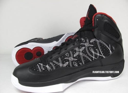
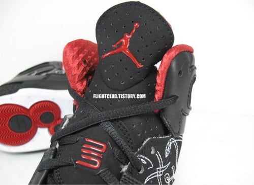
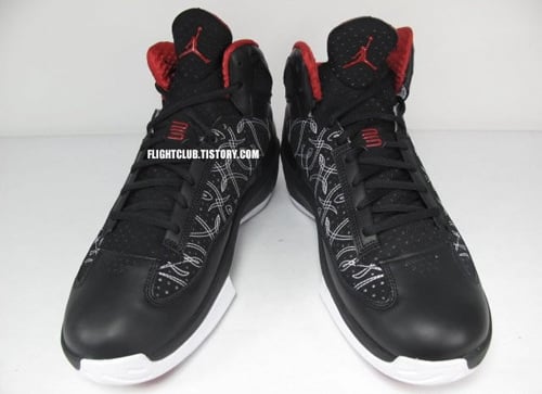
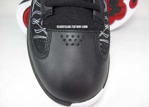
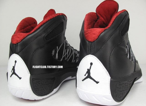
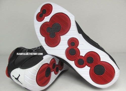
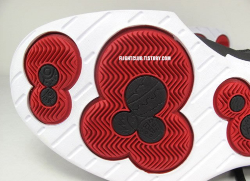
 We got our first look at the new Jordan Brand hybrid, the Air Jordan Icons, through a catalogue scan back in July, and now we have some images of the finished product. Synthesizing design elements from the Air Jordan XX and Air Jordan XXIII, this first version of the team basketball sneaker features a classic Red/Black/White color palette. The model takes inspiration from the AJXXIII for its tongue and midpanel stitching, and draws from the AJXX for its sole. Like a majority of the JB 2010 releases we’ve previewed, the model features the ’23’/25th anniversary logo on its tongue. Scheduled to hit retailers next March, check out some more detailed images after the jump.

i have been a jordan fan since the day i could walk in my first pair as a toddler.this has to be among the top 5 for best hybrids.that almost looks better than some of the actual jordans they have brought out.i will definitely have to have a pair of those
I think dude above me is buggin.. These are trash. They look like bootlegs.
These look like some fake hybrid shoes that you see idiots rock.
they look a hella lot better than the 2010s!!!
this shoe has a little 2k10 goin on too with the toe box and midsole but looks wayyyyyyyyy better than the 2k10. might copp to ball in if its cheap and lightweight.
ben you right on wit that one this should be the 2010's and top 5 never these aint touch'n the retro's 1-15
my bad he said hybrid to i say maybe
A blind drunk armed with only a container of glue and set loose among the scraps on the floor at the Nike ID factory could make something a lot better than these.
Why is there no lateral view??? cnt decide how I feel abt these right now
seem like they could be good balling kicks.
damn jordan making anything now this is total garbage
these are garbage. and probably for balling they put the 20 pods in the shoe and they have been known for poor grip and don't conform to the foot like the 21 and 23 do. who in the world thought to make this crap with the wrong additions?!
these r ugly
Is Not IT!!!!!!!!!!!
they not bad but not too good
iight i guess
Air Jordan Icons, alright the shoe looks nice, but my over all issue sometimes with the Jordans is support in the ankle area and arch area. To be honest I would like to see more colors and lets see more Jordan's of our choice on Nike ID. We pay for the shoe, why not have it the way we want it. The Air Jordan Icons could be a good shoe if the support is there and the right colors are released or if the shoe is on Nike ID. Also lets hope these shoes do not cost $175.00 or some other outlandish price they could think off. How about $100.00 even, and $110.00 on Nike ID.
I don't hate or dislike the Jordan brand or Nike, but sometimes when you over saturate the market people tend to tune you out because they are not getting what they want.
Idea for The Jordan Brand to consider– How about putting some of those retro's on Nike ID????
Thanks for reading
Juan Cummings
Be easy people.
Later
Def a good hybrid, not that into hybrids, like to stick to retro's, but they're def a better look than the 2010's. The 2010's have that independent toe box like the soldier III's which I like. I dont think these are a better hybrid than the 16.5's, but these are okay, I gotta agree w/ eddie, if they are lightweight and a decent price, I might cop.