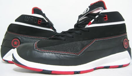
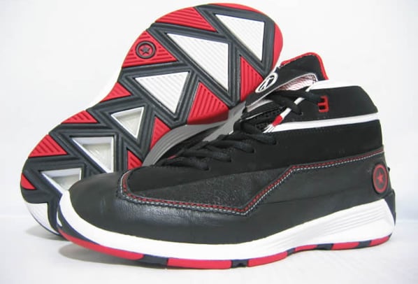
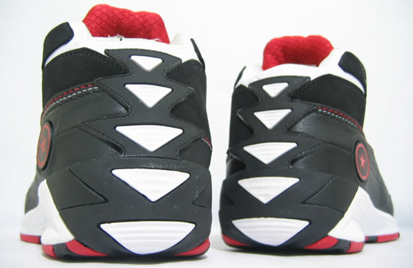
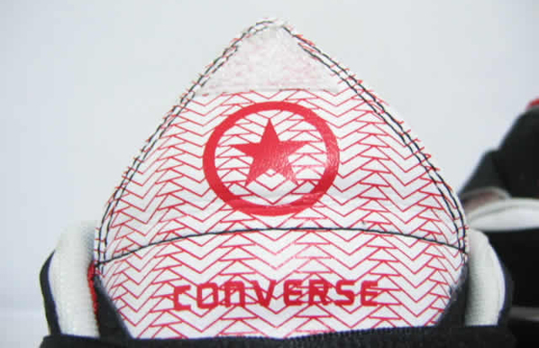
Here is the third installment in the Converse Wade line, known as the Wade 3.0. First color way is a Black, Red, White which is the Miami Heat team colors. There is a inspiration deeper than the eye on this pair. If you look closely you can see a lot of triangle shapes. You might wonder why this is, well a Triangle is known as one of the strongest shapes, which symbolizes strength, success, and unity.
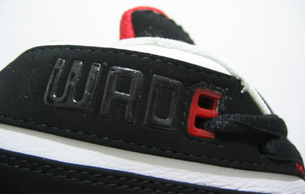
The well known Wade logo is on the tongue, also written is Wade at the upper heel portion. More information coming soon.

these is even worse than the other sneaks he has come out with
the other ones wasn't this bad
If this outsells any basket ball shoe next season, then all that means is that dwade's fans are blind, and dumb.
a big dissapointment i was hoping for something alot nicer than this ima a big wade fan hes my fav. player but these shoes is nasty def. not being copped
Yes they look a little off you could say but don't judge them until you try em on. They might be very comfortable. This makes me think of when the Adidas Kobe 2's came out. I thought they were the ugliest shoe ever but damn were they great to play in.
Is this some kind off joke???
They look old and cheap! and the quality looks like somebody's been playing in them……
The last 2.5 shoes (wade 1, 1.3, 2) have been great to play in even though I'm not a big fan of their looks. I'm interested in what is going on the back half of the sole. It looks like the last 3 triangles have been removed to show something. Anyone know what is going on with that. Is it like the LJ5 and the map or are they showing off some higher end shock absorption? All in all they don't look any worse than most of the JB stuff they have been putting out.
This is what dwayne wade gets for signin with converse…disgusting sneakers
This isn't April 1st is it?
Go buy Jordans, not these ugly pieces of crap.
YALL IS HATERS THESE KICKS ARE PRETTY GOOD. I WONT BUY THEM BUT I WOULD COMPLIMENT SOMEONE WEARING THEM. ONLY CONVERSE'S YOULL SEE ON MY FEET ARE ALL STAR HIGHS.YA DIG?
is THIS the way to put converse back on the map??
at least this makes the answer 11 look better
Wat do you mean L.Guapo? answer 11's are hot. these are trash!!! He should brainstorm again and just donate these to a third world country like Indonesia or sumthin
I Like these a whole lot, these are awesome
????????????????? I know Wade is how he is but mabye signing with the parent company might be the way to go. Thats one more signature show I dont have to worry about.
See the vital point is overlooked. The reason why these kicks( I believe )Are Nice is because there unique and also all of the wades kicks look exactly a like. These kicks are tight simply because it's not that same style as the previous selctions(kicks).
HEY ! These are one of the best d-wades they could have made IF…..they use different materials, maybe throw some patent in there, but overall I actually like the shoe.
if only it had a nike sign lol. i thought wade shoes were headed in the direction of jordans. first two not accepted, then third is revolutionary, oh well these look like the other ones, and just remind me of cloth on a persons feet, not shoes but just cloth.
These are an eyesore. To be fair the question i'd ask is "how involved is Wade in the design process". "Does this reflect Wade's personality". I'm guessing no! As a designer, i really hope 'a triangle' wasn't the only inspiration here. It reminds me of the Answer 8 where they had the genius idea of putting 8s all over it.
Personally i don't layers of ideas in this design. But i'll look for literature to prove otherwise.
I think the Wade logo (the '3') could be stronger also. Though its not the weakest logo set. Maybe have a more effective letter/number logo to compliment the silhouette logo.
Monkey First, I think Wade was fully involved in the design process…i mean fully.
but I honestly dont think these pictures reflect the final round sample that I saw of them.
They look good…and when you say Wade wearing them oncourt..people will like them more. You also have to remember that the Wades are only 100$'s….not 150 or 175 like jordan…so quality and innnovation will have its limits.
the worst shoes i've ever seen…
Dang.. These are like the worst signature player shoes ever. Not what I expected.. these things suck!
Answer 11s are the best.
im getting these.
i collect a lot of d wade shoes but for sure converse gonna think of good design for this year season dwyane is big time player he must desreve a good one by the why im happy that convers and nike are sister co.so why that this shoe looks like a cheap 1 just look at lbj and kobe its getting better and better go converse this is 3.0 its d wade no. hope this season he will wear a headturner shoe. godspeed converse
damn! ugly!
lebrons are the best!
Interesting, at best.
But surprisingly, everyone here (or most of everyone here) is concerned about the look.
Sure, the aesthetics are important but I ball. I don't want to think about my ill-looking shoes getting scratched up or twisting my ankle in them.
The Wade 2.0s were a snug fit. I'm sure these will be as well.
If they hold up the court abuse, I say they're good.
You can't compare these to Jordans…because the best MJs are all the Retros. But hey…that's so unoriginal compared to the Wade 3.0s.
Can't wait for the MU colorways!
Dude what the hell…
The 2.0 I thought were great but now they put this garbage out?
Ok, I think its time for Wade to sign a conratct with Nike… I'm sure they could come up with a better shoe
i gettin them
this shoe is tight.i hope i can have right now!!!when is this shoe going to have at the stores??answer back plss.how much does dis cost if buy it but its 4 kids though.I LOVE THIS SHOE!
i like dis shoe.i want to have it now!!
This shoe looks way better then the 2.0 i saw them at the mall yesterday there pretty sick when you see them they were like $100
wade it look's lik u made boots 4 da first time lmao!!
come on dwade step it up
don't be stupid , I agree , the shoes don't look that nice on pics , but if u see them in real , then theey're flyyyyy , and comfortable too , d wade fo evaaahhh